
With mobile optimization, your template automatically adapts the content to smaller screens, ensuring that text remains readable and images don’t become blurry. In this guide, you’ll learn how to enable mobile optimization on the default template, see the difference between the desktop and mobile versions, and test your newsletter properly.
Enable mobile optimization
Go to Step 2 of your campaign and click Settings → Mobile Optimization.
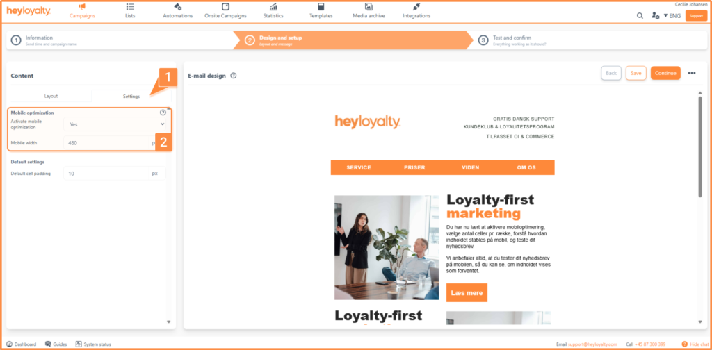
When mobile optimization is enabled, the template automatically adapts the content to small screens. This ensures that:
- The text remains legible
- Images should not be scaled down so much that the message becomes unclear
- The frames in your template work correctly on mobile devices
If you notice that the content appears very small, it’s because some of the content in your email is wider than 480 px. You’ll need to adjust this in Step 2. Most often, it’s the width of an image or cells that exceeds 480 px.
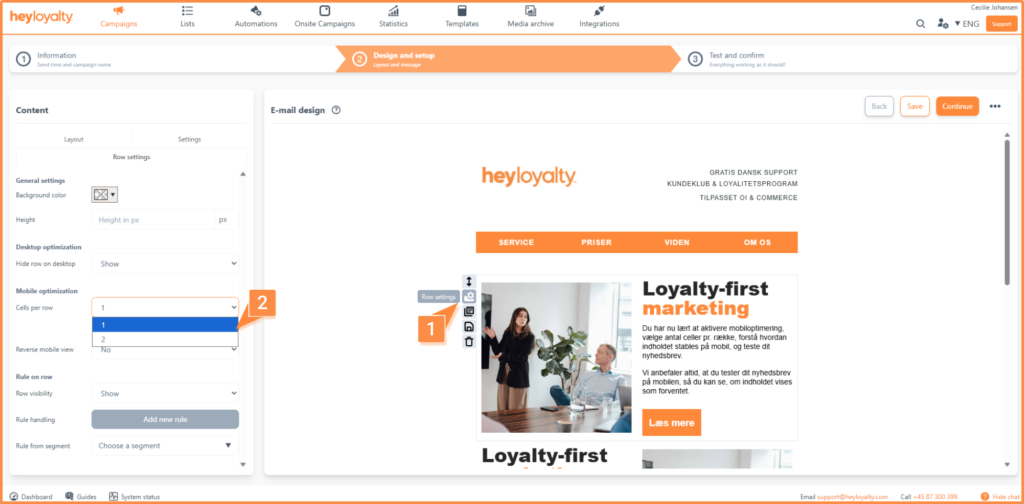
Mobile layout
Rows with multiple cells will be “stacked” on top of each other. It doesn’t matter whether a row contains 2, 3, 4, 5, or 6 cells.
In other words: If you have two blocks next to each other on the desktop version (large screen), they will be placed one above the other on mobile:

If you want to change this order, please read the section below.
Mobile Optimization and Sort Settings
If you’ve split your row into multiple cells, you can choose how many cells to display per row on mobile devices. To do this, go to Row Settings. Under Mobile Optimization, you can select how many cells to display at a time.
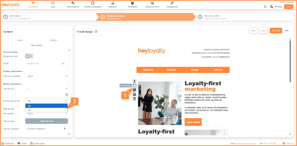
Under Row Settings, you can also choose whether the cells should be displayed in reverse order on mobile devices. This means that the last cell in the row will appear first on mobile devices. This setting may be useful if you have two consecutive rows with text and an image, where the layout needs to make more sense on mobile devices. We recommend that you test this setting and see how the layout appears in Step 3.
Hide cell on mobile
You can also hide a cell on mobile devices, in which case it will only be visible on desktop devices. To hide the row, go to Cell Settings. There , find the Hide cell on mobile setting . Set the setting to ” Hide.”
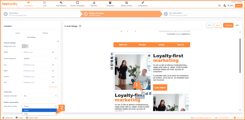
If you want to hide an entire row on your phone, go to the cell settings for each cell and set the option to Hide.
Ready to send mobile-friendly newsletters
You have now learned how to enable mobile optimization, choose the number of cells per row, understand how content is stacked on mobile devices, and test your newsletter. We always recommend that you test your newsletter on a mobile device so you can see if the content displays as expected.
With the mobile optimization settings, you can ensure that your recipients have a great experience, whether they open the email on a desktop or a mobile device. Get started optimizing your next newsletter now and see the difference for yourself.